
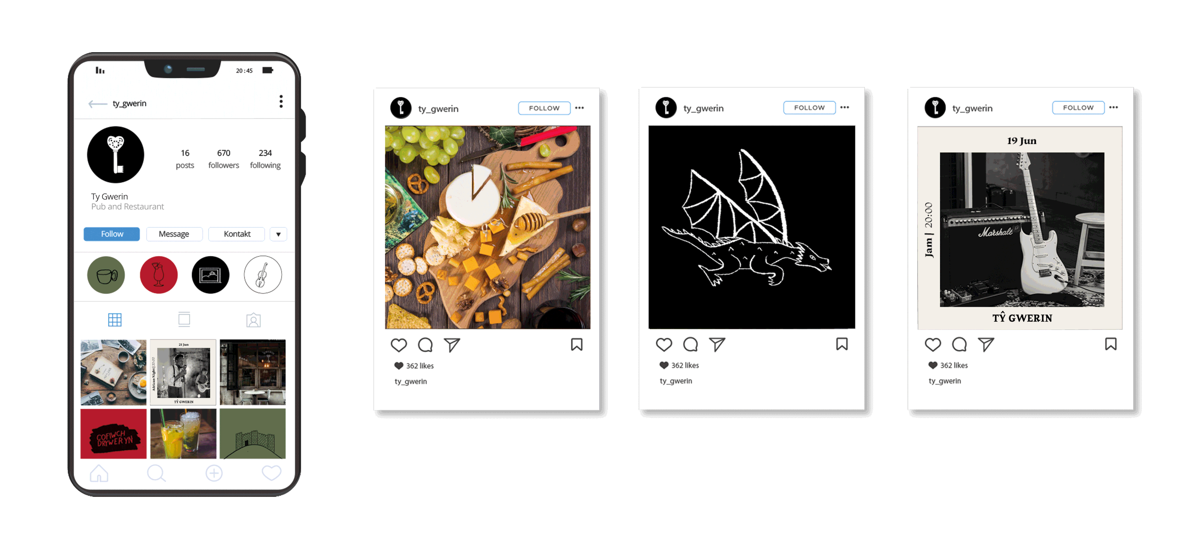
TY GWERIN
Concept | Brand Design | Illustration
Naming: together with Daniel Pearce
Text editing and Welsh translation: Daniel Pearce
Ty Gwerin is a branding project for a pub and restaurant with art and live music events based in Wales. Ty means "house" in Welsh and gwerin means "folk", a word which has various meanings in both Welsh and English. Firstly, it can be used to refer to people in general or the masses; secondly, to family or race; thirdly, to the art and customs that are traditional or typical of a particular community or nation. Therefore, translated it would mean the house of folk (or the house of people and folklore).
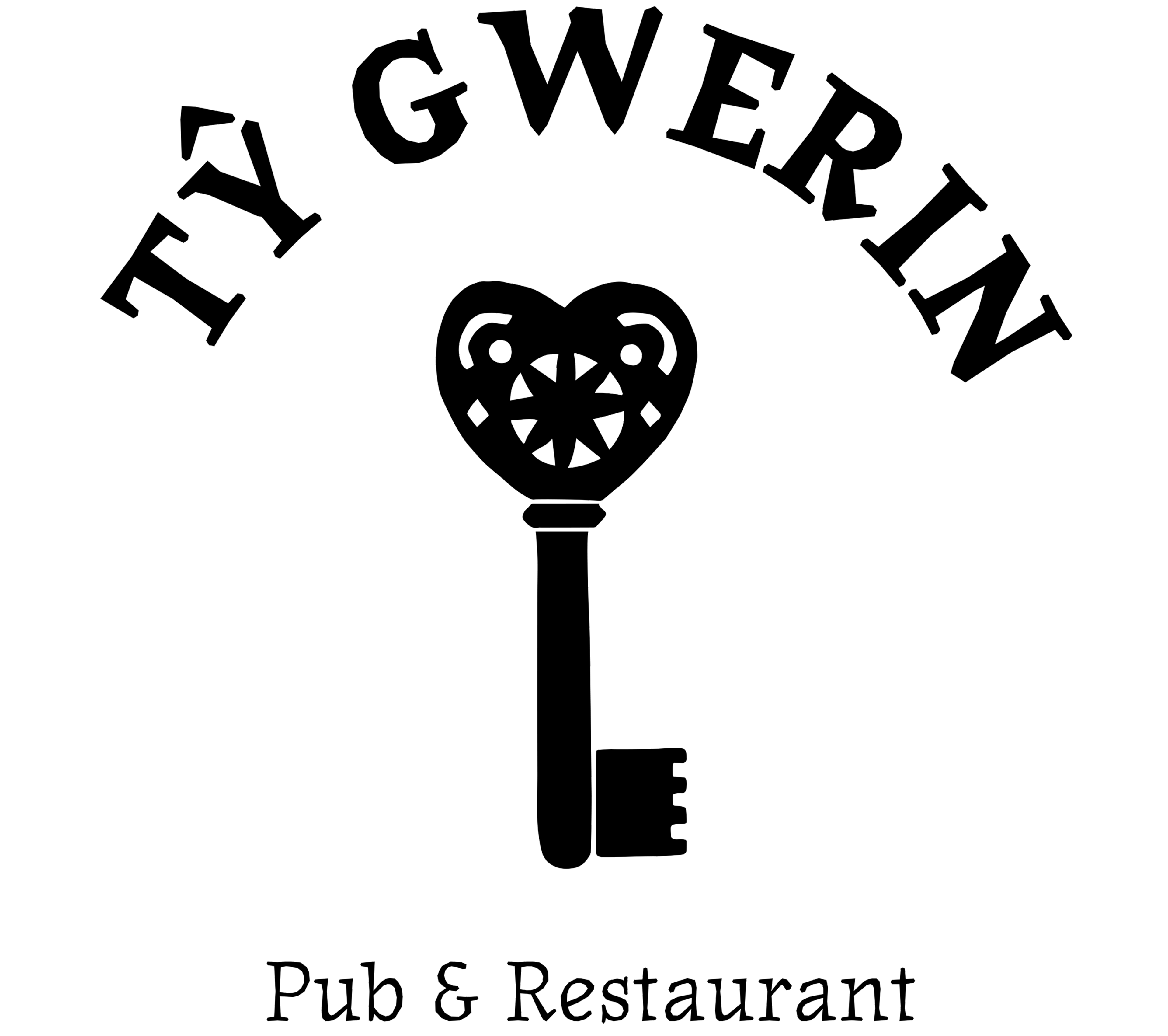
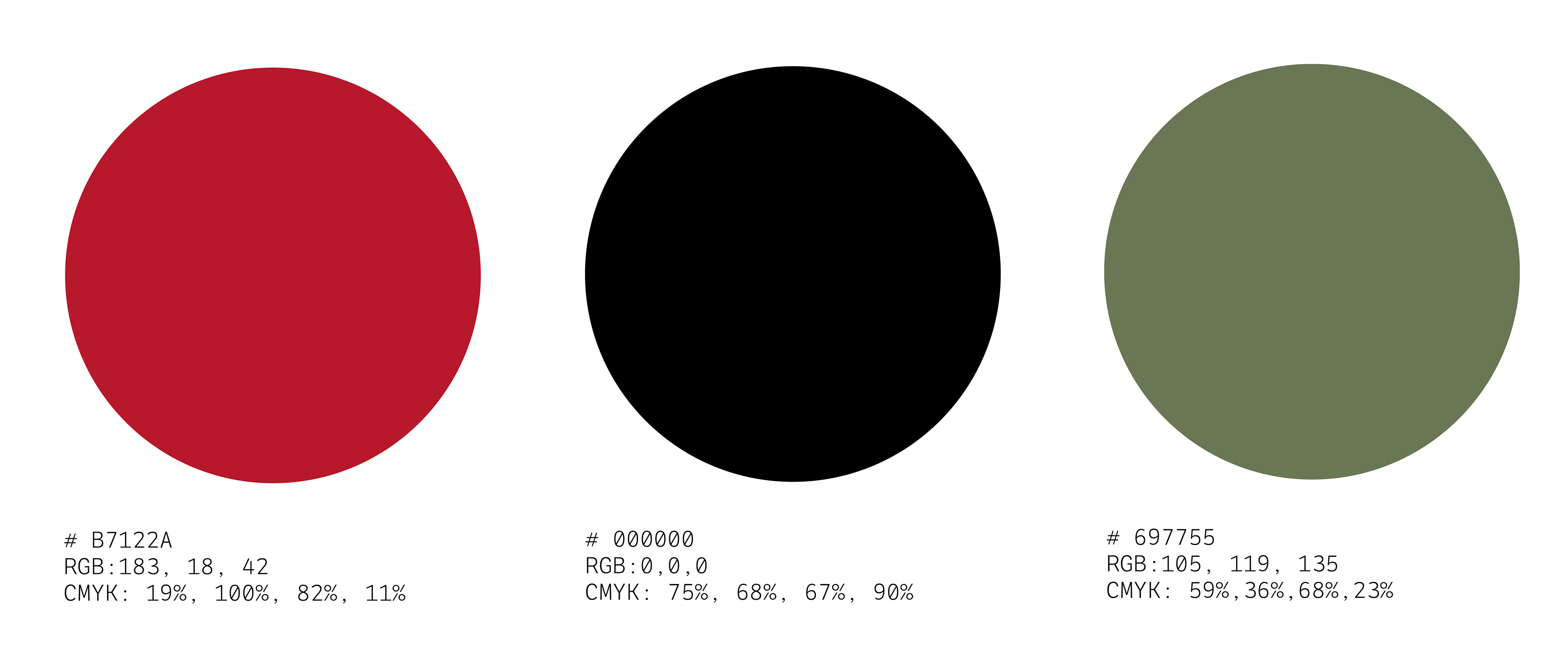
The identity was inspired by Welsh folklore, music, language, poetry and myths. Language is one of the most important things in Welsh culture which is why I got inspired by these 2 quotes: firstly “Cenedl heb iaith, cenedl heb galon” which means "A nation without a language is a nation without a heart” and secondly “If culture was a house, then language is the key to the front door; to all the rooms inside.”by Khaled Hosseini. That is why, for the symbol, I decided to abstract and fusion the heart and the key. The pattern in the key is an abstraction of Welsh lovespoons. The colours were chosen: red was taken from the Welsh dragon, green was abstracted from the Welsh mountains and flag and black for coal mining.


The design of the menu is inspired by vintage books, because Wales is a country famous for its poets and writers. The menu cover is an abstraction of the smallest house in Wales. The inside is inspired by poetry books.
Interested in working together?